# CSS
# flex布局
# 父元素
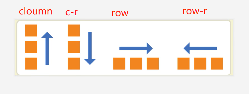
flex-direction: row / row-reverse / column / column-reverse
flex-wrap:nowrap(不换行) / wrap(换行,第一行在上边) / wrap-reverse(换行,第一行在下边)
flex-flow:flex-direction & flex-wrap 的简写形式
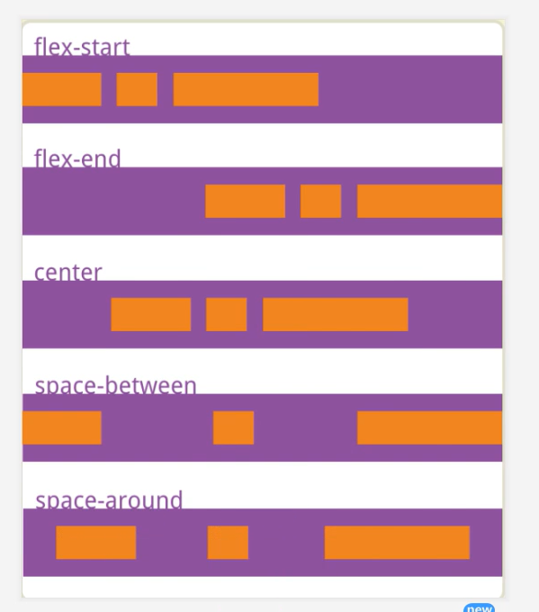
justify-content:项目对主轴的对齐方式
flex-start flex-end center space-between space-around
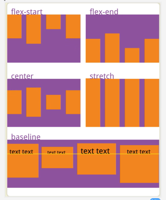
align-items: 子元素对父元素交叉轴的对齐方式 flex-start flex-end center stretch baseline
# 子元素
order:数值越小越靠前
align-self
flex-start flex-end center
注意:如果没有给子元素设置align-selft,它默认继承align-items的属性
# 常用垂直居中方法
# 1.父元素设置相对定位,子元素设置绝对定位,Margin:auto
<div id="box">
    <div id="child"></div>
</div>
#box {
    width: 300px;
    height: 300px;
    background-color: red;
    position: relative;
}

#child {
    position: absolute;
    top: 0;
    left: 0;
    bottom: 0;
    right: 0;
    margin: auto;
    width: 150px;
    height: 100px;
    background-color: blue;
}
# 2.利用flex布局
#box {
    width: 300px;
    height: 300px;
    background-color: red;
    display: flex;
    flex-direction: column;
    justify-content: center;
}
#child {
    align-self: center;
    width: 150px;
    height: 100px;
    background-color: blue;
}
# 3.父元素设置相对定位,子元素设置绝对定位 利用transform: translate
#box {
    width: 300px;
    height: 300px;
    background-color: red;
    position: relative;
}

#child {
 position: absolute;
    left: 50%;
    top: 50%;
    width: 150px;
    height: 100px;
    transform: translate(-50%,-50%);
    background-color: blue;
}
# 4.利用display-tab
#box {
    width: 300px;
    padding:100px; // 设置table-cell和vertical-align属性时,子元素会默认撑满父元素,所以需要添加一个padding
    background-color: red;
    display: table;
}
#child {
    display: table-cell;
    vertical-align: center;
    width: 100px;
    height: 100px;
    background-color: blue;
}